Halftone: From Newspaper Ink to Digital Shaders
How halftone printing works: from 1880s newspapers to real-time GPU shaders. Create CMYK, newspaper, and pop art dot effects with WebGL.

Pick up any newspaper. Look closely at the photos. Those smooth gradients you see from a distance? They're actually thousands of tiny dots.
This is halftone. A technique invented in the 1880s that solved a fundamental problem: how do you print continuous-tone photographs using ink that's either there or not there?
The answer: instead of trying to vary the darkness of the ink, you vary the size of the dots.
The problem with ink
Before halftone, printing photos was basically impossible. Lithography could reproduce drawings with lines and solid areas, but photographs have continuous tones—infinite shades of gray transitioning smoothly into each other.
Ink doesn't do "half dark." It's binary. On or off.
Early attempts to print photos involved hand-engraving wood blocks or using photographic processes that couldn't be mass-produced. Newspapers ran illustrations, not photos.
The breakthrough came from multiple inventors working in parallel. In 1880, Stephen Horgan at the New York Daily Graphic published "A Scene in Shantytown"—the first halftone photograph printed in a newspaper. He placed a fine screen between the photograph and printing plate during exposure. Light passing through the screen created the dot pattern automatically.
A year later, Frederic Ives patented the first commercially viable halftone process. His method was more practical for mass production, and by the 1890s, every major newspaper was printing photographs.
Why dots work
Your eye has limited resolution. From a normal reading distance, you can't distinguish individual printer dots (typically 85-150 per inch). Your visual system averages them together.
This is the same principle behind pointillism in painting, and later, LCD screens. Georges Seurat was painting with dots around the same time Ives was patenting halftone printing.

The math is straightforward. If dots cover 80% of an area, it looks dark. If they cover 20%, it looks light. The dot size maps directly to perceived brightness.
// Luminance determines dot size
float brightness = dot(color.rgb, vec3(0.299, 0.587, 0.114));

// Dark areas = big dots, light areas = small dots
float dotRadius = sqrt(1.0 - brightness) * maxRadius;
The square root is important. Human perception of brightness isn't linear—we're more sensitive to changes in dark tones than light ones. The square root compensates for this.
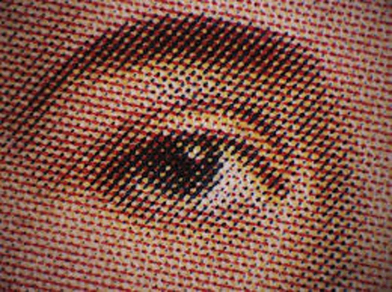
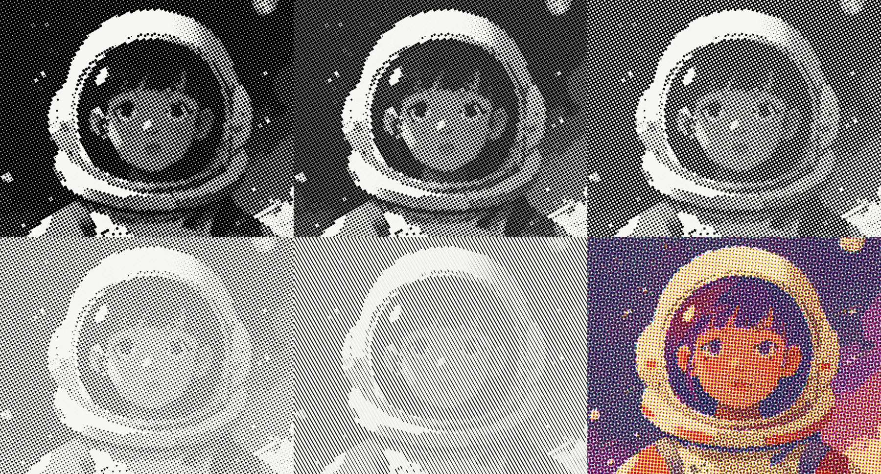
Classic single-color halftone on a portrait
Try mono halftone
The moiré problem
Put two dot grids on top of each other, and you get interference patterns. Wavy bands that weren't in the original image. This is moiré—the biggest headache in halftone printing.
Color printing made this worse. CMYK printing uses four separate halftone screens—one for each ink. If they all had the same angle, the moiré would be overwhelming.
The solution: rotate each screen to a different angle.
The traditional angles are:
- Cyan: 15°
- Magenta: 75°
- Yellow: 0°
- Black: 45°

Yellow gets 0° because it's the lightest color and least visible. Black gets 45° because diagonal patterns are least noticeable to the eye. Cyan and magenta are spaced 60° apart to minimize interference.
// Traditional CMYK screen angles
const float ANGLE_C = 0.2618;   // 15 degrees
const float ANGLE_M = 1.309;    // 75 degrees
const float ANGLE_Y = 0.0;      // 0 degrees
const float ANGLE_K = 0.7854;   // 45 degrees
These specific angles weren't arbitrary. Printers tested different combinations for decades, and these became the industry standard because they produced the least visible moiré.
CMYK and subtractive color
Print works by subtraction. White paper reflects all light. Ink absorbs some wavelengths and reflects others.
Cyan ink absorbs red light. Magenta absorbs green. Yellow absorbs blue. Combining them gives you darker colors. In theory, CMY should give you black—but in practice, printing inks aren't pure enough, so you get muddy brown. That's why black (K) is added as a fourth ink.

Converting RGB to CMYK:
vec4 rgbToCmyk(vec3 rgb) {
  // K = 1 - max(R, G, B)
  float k = 1.0 - max(max(rgb.r, rgb.g), rgb.b);

  if (k >= 1.0) return vec4(0.0, 0.0, 0.0, 1.0); // Pure black

  // C, M, Y adjusted for black
  float c = (1.0 - rgb.r - k) / (1.0 - k);
  float m = (1.0 - rgb.g - k) / (1.0 - k);
  float y = (1.0 - rgb.b - k) / (1.0 - k);

  return vec4(c, m, y, k);
}
The formula removes the black component from each channel. This is "undercolor removal"—instead of printing heavy layers of CMY to get dark colors, you use black ink, which is cheaper and dries faster.
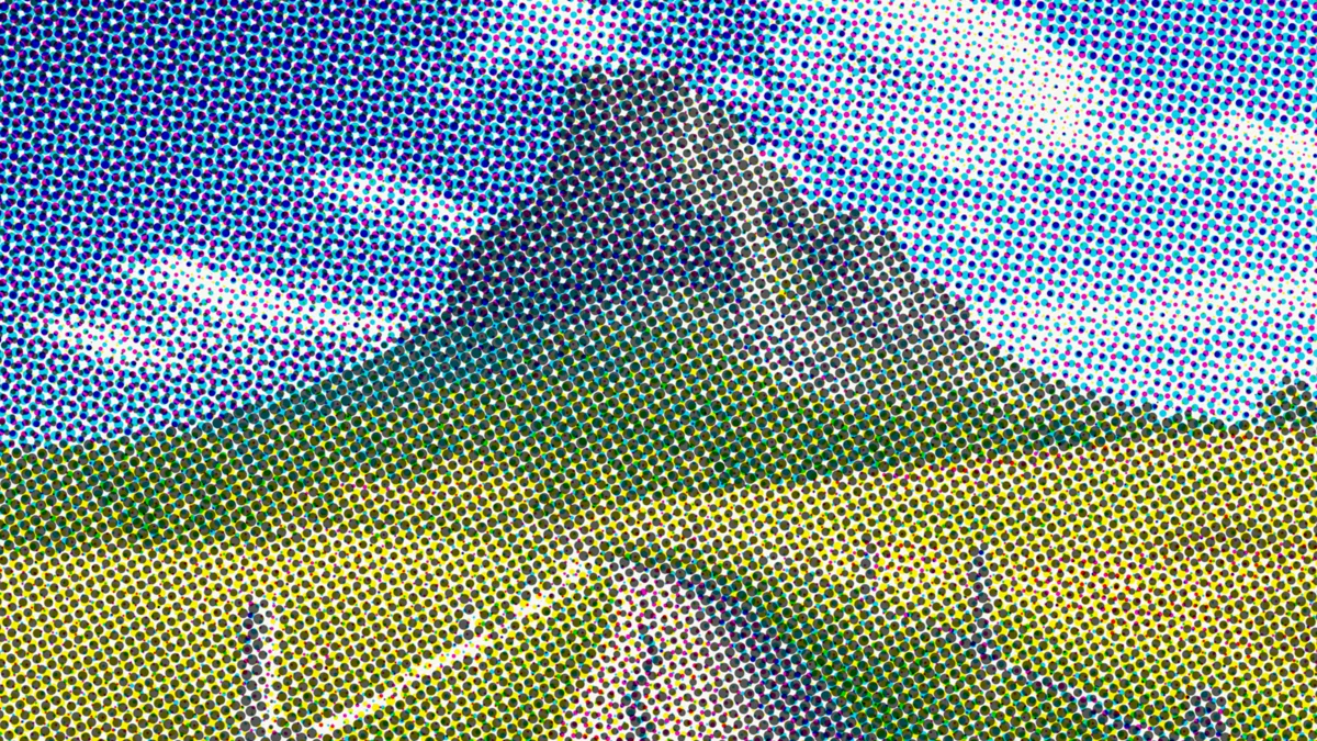
Full color process printing simulation
Try CMYK halftone
Dot gain and registration
Real printing has imperfections. Ink spreads when it hits paper—a phenomenon called dot gain. Small dots grow, and large dots grow into each other.
Misregistration happens when the printing plates don't align perfectly. You see color fringing—cyan shifted left, magenta shifted up.
These "flaws" are part of the halftone aesthetic. They give printed material a physical quality that digital images lack.
In Efecto, you can simulate both:
// Dot gain - allow dots to grow beyond their cell
float maxRadius = cellSize * (0.5 + spread * 0.5);

// Misregistration - offset each color channel
vec2 coordC = pixelCoord + vec2(-0.7, -0.7) * misregAmount;
vec2 coordM = pixelCoord + vec2(0.7, -0.5) * misregAmount;
vec2 coordY = pixelCoord + vec2(0.0, 0.8) * misregAmount;
Simulated printing plate misalignment
Try with misregistration
Digital halftone
Halftone in software is simpler than physical printing. No screens, no ink, no registration issues (unless you want them).
The algorithm:
- Divide the image into a grid of cells
- Sample the image at each cell center
- Calculate brightness
- Draw a dot sized proportionally to brightness
void mainImage(const in vec4 inputColor, const in vec2 uv, out vec4 outputColor) {
  // Cell size in pixels
  float cellSize = mix(4.0, 50.0, uDotSize);
  vec2 pixelCoord = uv * uResolution;

  // Rotate for angled grid
  vec2 rotatedCoord = rotate2D(pixelCoord, uAngle);

  // Find cell and its center
  vec2 cellId = floor(rotatedCoord / cellSize);
  vec2 cellCenter = (cellId + 0.5) * cellSize;

  // Sample image at cell center
  vec2 sampleUV = rotate2D(cellCenter, -uAngle) / uResolution;
  vec4 texColor = texture2D(inputBuffer, clamp(sampleUV, 0.0, 1.0));

  // Brightness determines dot size
  float lum = dot(texColor.rgb, vec3(0.299, 0.587, 0.114));
  float dotRadius = sqrt(1.0 - lum) * cellSize * 0.5;

  // Distance from cell center
  vec2 posInCell = mod(rotatedCoord, cellSize) - cellSize * 0.5;
  float dist = length(posInCell);

  // Draw dot
  float dot = 1.0 - smoothstep(dotRadius - 1.0, dotRadius + 1.0, dist);

  outputColor = vec4(mix(paperColor, inkColor, dot), 1.0);
}
The key insight: you sample at cell centers, not at every pixel. This is what creates the "stepping" effect where areas of similar brightness get similar-sized dots.
Beyond circles
Traditional halftone uses round dots. But you can use any shape.
Squares give a more mechanical, digital feel. Lines create a directional quality. Diamonds feel sharper.
In Efecto, shape is just a different distance function:
// Circle
float sdCircle(vec2 p, float r) {
  return length(p) - r;
}

// Square
float sdSquare(vec2 p, float r) {
  vec2 d = abs(p) - vec2(r);
  return max(d.x, d.y);
}

// Diamond (4-pointed star)
float sdDiamond(vec2 p, float r) {
  float angle = atan(p.y, p.x);
  float d = length(p);
  float starRadius = r * (0.5 + 0.5 * pow(abs(cos(2.0 * angle)), 0.8));
  return d - starRadius;
}
4-pointed star dots instead of circles
Try diamond halftone
Try it
 OriginalDithered
Newspaper
Classic black-on-white newsprint look.
 OriginalDithered
Pop Art
Big dots, bright colors. Very Lichtenstein.
 OriginalDithered
Process Color
Full CMYK with slight misregistration for authenticity.
Open Efecto
Try halftone yourselfFurther reading
History:
- Printing in the Machine Age - How halftone changed newspapers
- The Halftone Printing Process - Britannica's technical overview
Technical:
- Color Management in Commercial Printing - Deep dive into CMYK and screen angles
- Digital Halftoning - Academic paper on digital halftone algorithms
Visual:
- Ben-Day Dots - MoMA's explanation of the printing technique Lichtenstein borrowed
- Newspaper Photography Archive - Library of Congress collection of early newspaper photos