What is Dithering?
From 1869 newspapers to Game Boy screens, and how dithering fools your brain with dots.
I'm obsessed with dithering.
Those carefully placed dots and pixels get me every time. When an image uses only two colors but somehow fools your brain into seeing dozens of shades, that's the trick. The image is just black and white, you know it's just black and white, but your brain doesn't care.
The illusion of more
Dithering is a technique that creates the appearance of more colors or shades than you actually have. It does this by carefully arranging pixels of different colors in patterns that your eye blends together.
Think about it: if you have only black and white pixels, how do you show gray? You can't. But you can mix black and white pixels in a checkerboard pattern, and from a distance, your brain sees gray. That's dithering in its simplest form.
The technique comes from print. Before computers existed, newspapers had to figure out how to print photographs using only black ink on white paper. They used halftones, tiny dots of varying sizes that created the illusion of continuous tone. The smaller the dots, the lighter the area appeared.
A brief history of dots
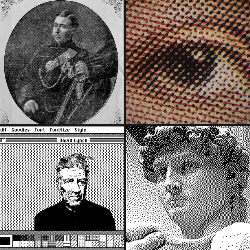
The story starts in 1869. William Leggo and George Desbarats published what's considered the first commercially printed halftone photograph in the Canadian Illustrated News. Before this, newspapers used hand-carved woodcuts to reproduce images. Halftones made photos printable.
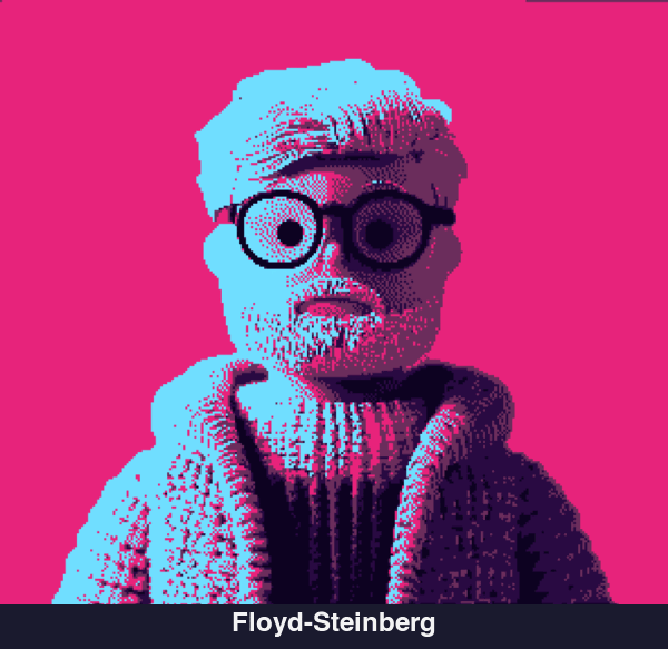
But the digital dithering we know? That started with a 1976 paper by Robert Floyd and Louis Steinberg: "An Adaptive Algorithm for Spatial Greyscale." They figured out that if you push the "error" of rounding a pixel to the nearest available color onto its neighbors, you get these organic-looking patterns. This is called error diffusion, and most dithering still builds on it.
The original error diffusion algorithm from 1976
Try Floyd-Steinberg ditheringThen came the Macintosh.
In 1984, Bill Atkinson needed to display photographs on a computer that could only show black or white. No grays. His solution was a variant of Floyd-Steinberg that intentionally throws away 25% of the error. This gives you images with more contrast and "snap" that worked really well on the Mac's screen. If you've ever seen those classic MacPaint images, that's Atkinson dithering.
Bill Atkinson's algorithm from the original Macintosh
Try Atkinson ditheringWhy different algorithms look different
This part gets a bit technical.
All error diffusion algorithms work the same basic way: you scan through the image pixel by pixel, and for each one, you find the closest color in your palette. The difference between what you wanted and what you got is the "error." You then spread that error to neighboring pixels that haven't been processed yet.
The difference between algorithms is how they spread that error.
Floyd-Steinberg spreads to 4 neighbors with a specific weighting. It's fast and produces smooth results, but can sometimes look a bit "muddy" in midtones.
Atkinson spreads to 6 neighbors but only passes along 75% of the error. This creates higher contrast images with less of that muddy quality. Works great for line art and high-contrast photographs.
Jarvis-Judice-Ninke spreads to 12 neighbors using a complex weighting matrix. It's slower but produces very smooth gradients. Published the same year as Floyd-Steinberg, it was described in "A Survey of Techniques for the Display of Continuous Tone Pictures on Bi-level Displays".
Sierra and Stucki are variations that trade off between speed and quality. Sierra is a faster approximation of Jarvis, while Stucki is a refinement that many consider superior for photographic work.
The 12-neighbor algorithm for ultra-smooth gradients
Try Jarvis-Judice-NinkeBeyond black and white
Two-color dithering is classic, but things get more interesting when you add more colors.
The Game Boy had four shades of green. Just four. But look at those games. They didn't feel limited. Artists learned to work within those constraints, and the results were often more memorable than games with millions of colors.
The classic 4-color palette from 1989
Try Game Boy paletteThis is why I added multi-color palette support to Efecto. You can use synthwave colors, go full cyberpunk with magentas and cyans, or create your own palette.
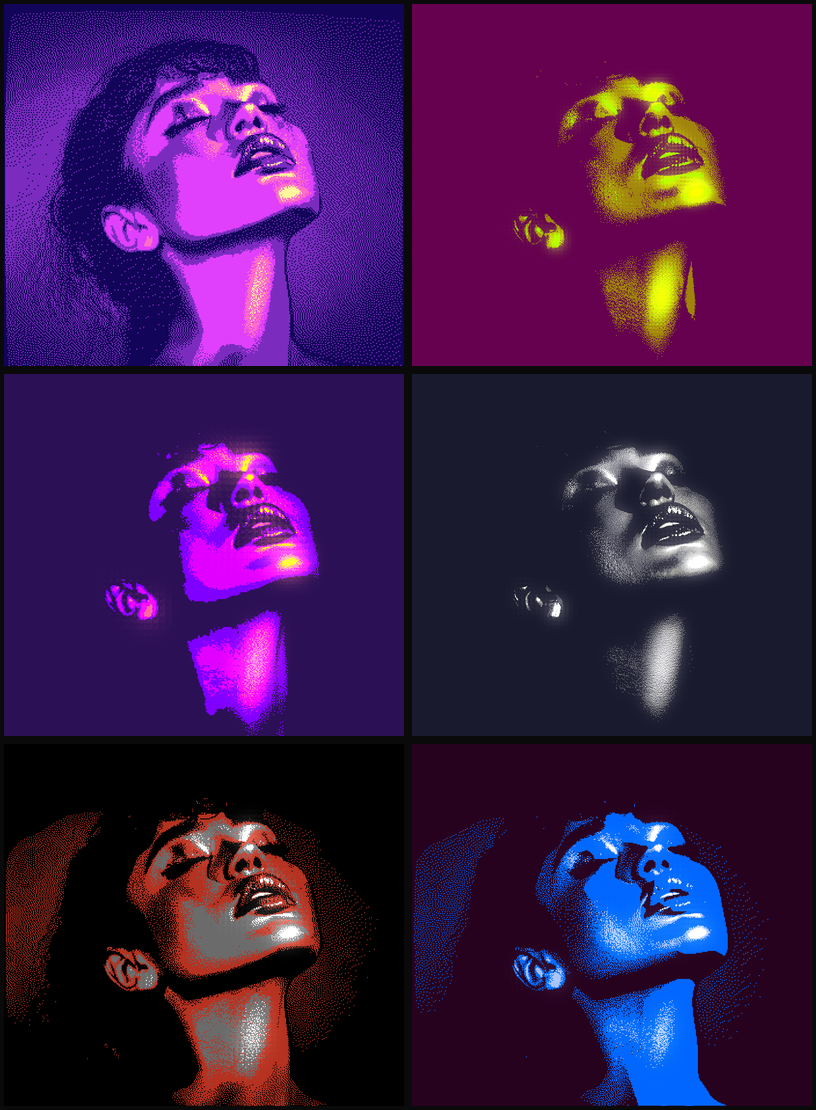
The order of colors in your palette matters too. In Efecto, you can drag to reorder them. The darkest color represents shadows, the brightest represents highlights, and everything in between maps to the midtones. Flip them around and you get inversions. Mix them up and you get psychedelic results.
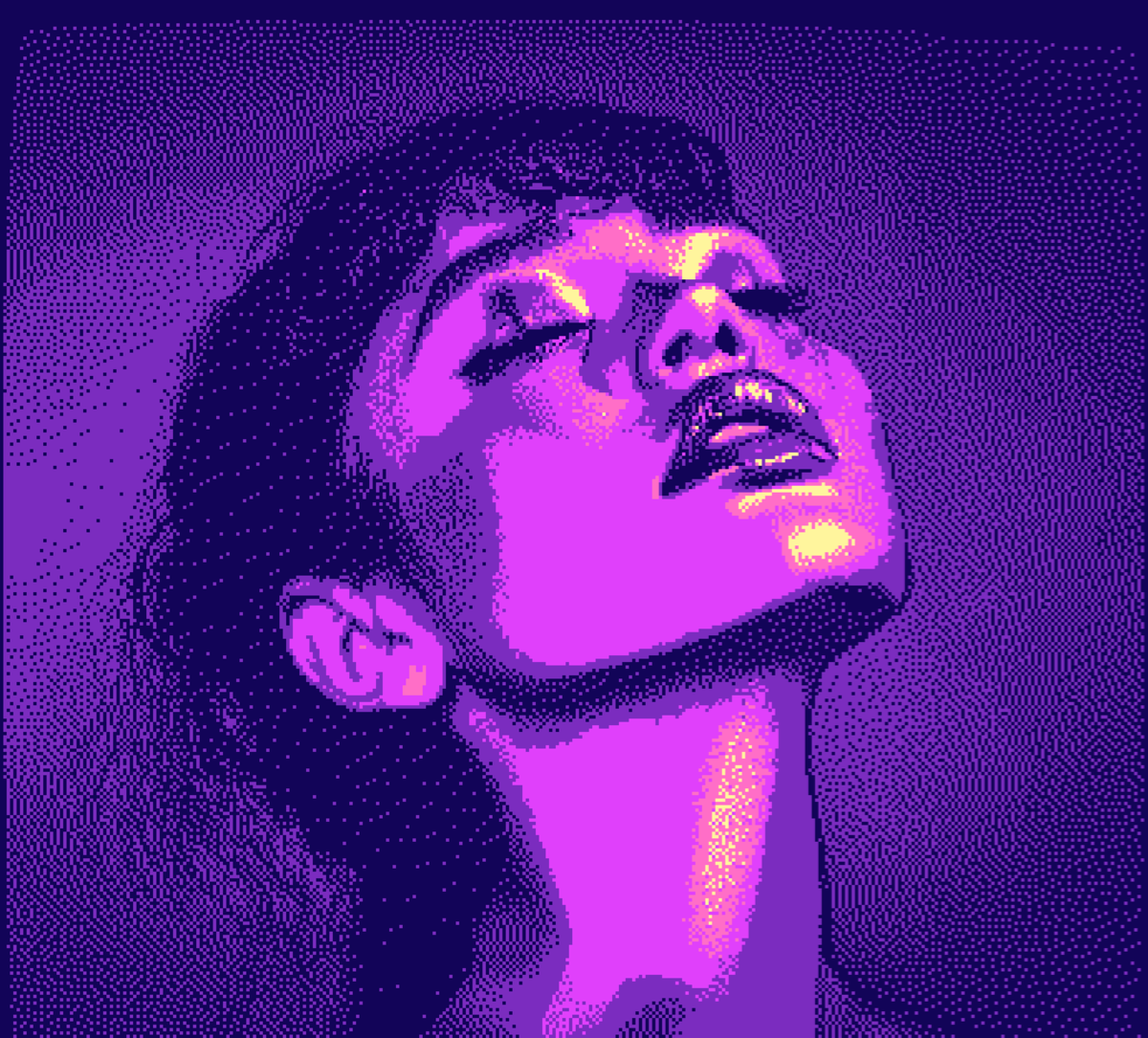
Pink, purple, and cyan gradients
Try Synthwave paletteThe bloom trick
Adding a subtle bloom effect to dithered images is one of my favorite things.
Dithering naturally creates high-contrast pixel patterns. When you add bloom, the bright pixels glow into the dark ones, softening the harsh edges while still looking dithered. It's like the difference between a sharp LED display and a warm CRT.
Green monochrome with bloom enabled
Try dither with bloomWhy I love this stuff
I think a lot about how constraints shape what you make. Dithering is a good example.
When you can only use a handful of colors, every pixel matters. There's no hiding behind gradients or blur. The algorithm has to make decisions, and those decisions create texture. It's honestly closer to printmaking than typical digital art.
Watching a complex photograph reduce down to patterns of dots is weirdly satisfying. All that information compressed into something so simple, but still recognizable.
Try it yourself
The best way to understand dithering is to play with it. Here are a few starting points:
 OriginalDithered
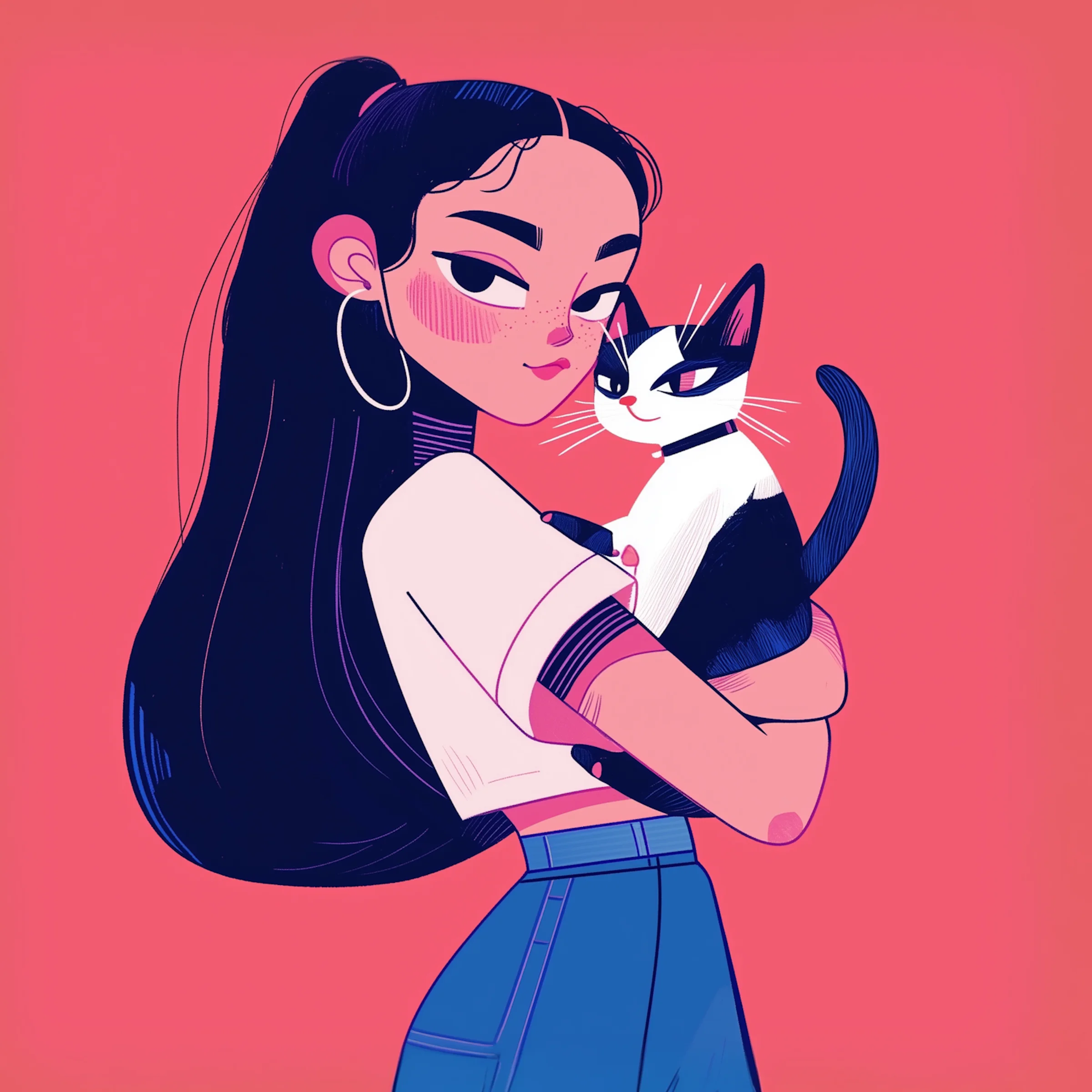
Photo
Floyd-Steinberg with subtle bloom.
 Original
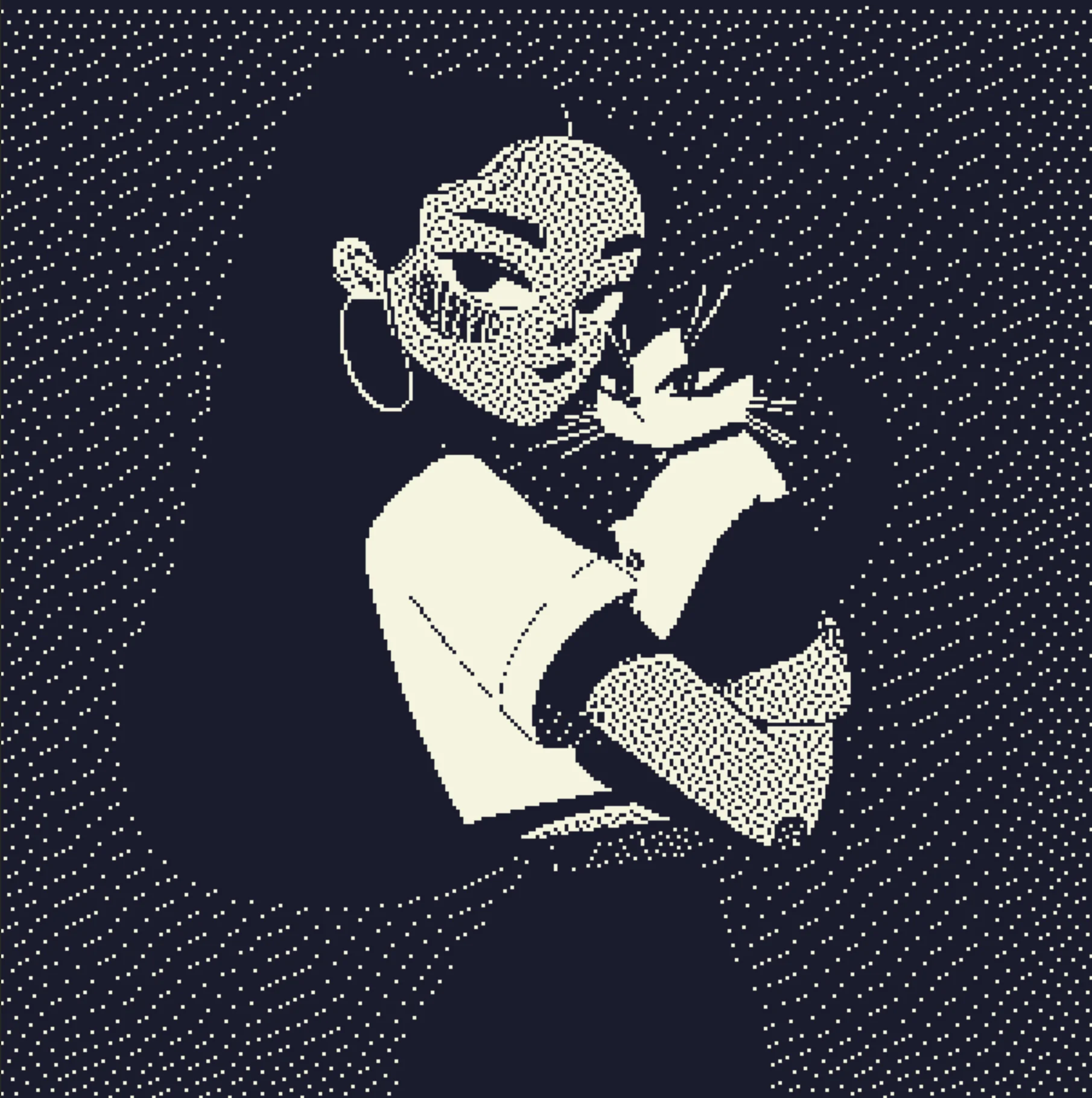 Dithered
Illustration
Atkinson with a custom ink palette.
 Original
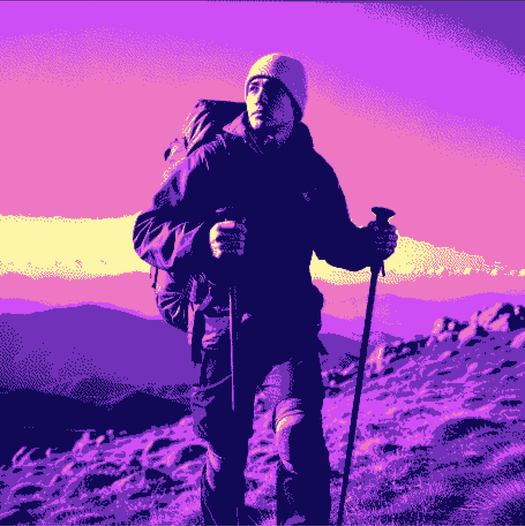 Dithered
Modern
Floyd-Steinberg with a neon palette.
 Original
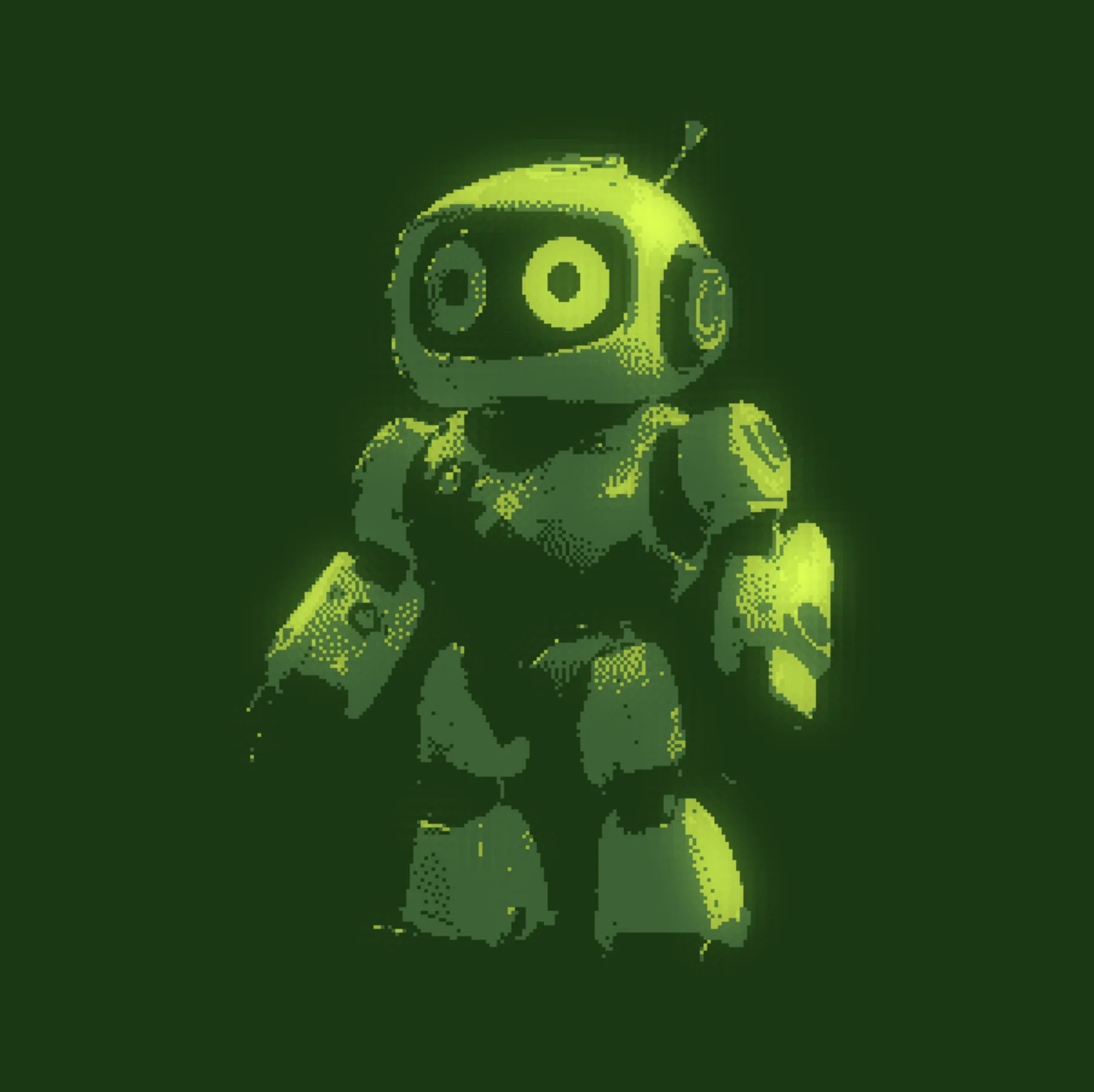 Dithered
Retro
Stucki with a Game Boy palette.
Try it out
Open Efecto